Google rolling out new map and local interface in search

Google will show local results on the left and a map on the right of those results.
Google’s confirmation. A Google spokesperson said “We’re constantly exploring ways to connect people with the helpful information that they’re seeking. We’re currently rolling out an update to the Search interface on desktop so when people search for places or businesses nearby, like ‘parks near me’ or ‘restaurants near me,’ they’ll easily see local results on the left and a map on the right. We expect this to be broadly available over the coming weeks.”
The new design. Here is a screenshot showing the map to the right side of the local search results:

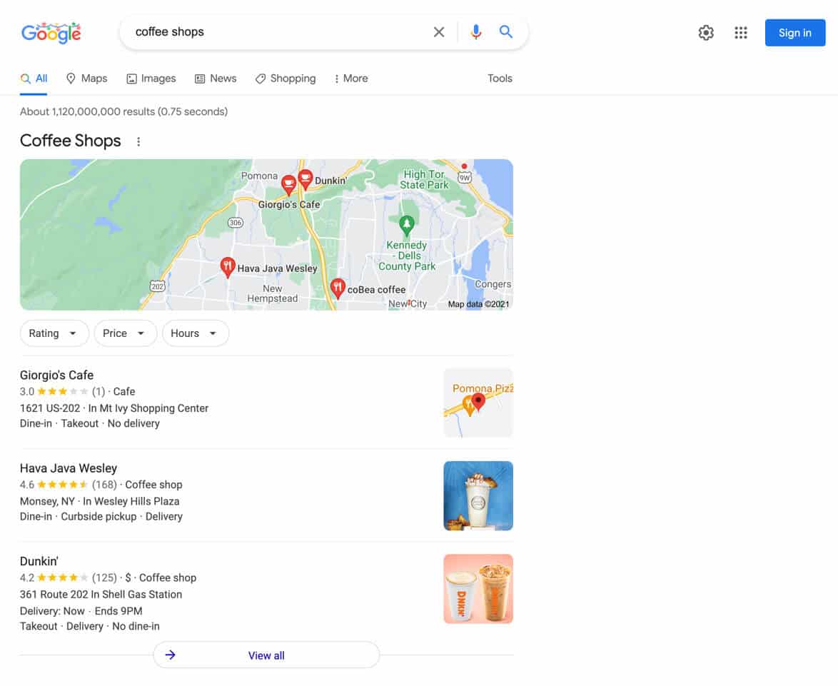
The old design. This is the old design with the map at the top and the local results below the map:

Testing. Google has been testing this new design for several months now and just this week, we saw a spike in the number of people seeing this new design. In fact, I’ve been seeing it myself over the past few days. So we asked Google to confirm the rollout and the search company has confirmed it.
Why we care. If you or your clients see a lot of traffic and business from the Google local results, you may see changes to that traffic. The local results are now higher up on the desktop search results page, with the map being move from the top to the right side of the page.
I also recently saw some local SEOs talk about recently seeing changes to their local search traffic, we suspect it was a local ranking update, but it also might be related to this design change.
In any event, check the queries that you rank well for in your Google Business Profile insights and see how they appear in desktop search. It might mean more or less traffic, depending on the design change and placement of your local listings.


