Bing Goes Search-Retro With Cleaner Look For Results

Microsoft has started to roll out a new, simpler look for the Bing SERP. It looks very much like the “old Google.” It’s more spartan than the previous Bing UI — or “clean” if you prefer. As Google has added more graphics, icons and features to its SERPs some have complained that the pages are starting […]
Microsoft has started to roll out a new, simpler look for the Bing SERP. It looks very much like the “old Google.” It’s more spartan than the previous Bing UI — or “clean” if you prefer. As Google has added more graphics, icons and features to its SERPs some have complained that the pages are starting to look cluttered or bloated.
The Bing blog says that the intent behind the new SERP is to a create a “fresh, de-cluttered experience designed to help you find the results you want faster” and to make the page “easier to scan.”
Google and Bing Switch Places
Bing originally launched with a visually richer UI and an effort to bring more content and filters to the SERP (“answers not links”). Bing’s more “visual” and somewhat “warmer” UI were differentiators from Google. But Bing’s new-look UI is much more Googly, although Microsoft would never describe it that way. In a way Google and Bing have now switched positions.
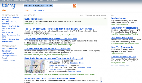
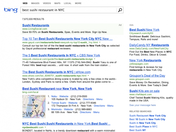
Below are two examples of the previous and the new Bing SERP. I compared the queries “search market share” and “best sushi in NYC.” Whether you like the new Bing SERP is partly going to be a function of personal taste and whether you feel nostalgia for a simpler SERP.
Old Bing
The “old UI” has fliters and refinements in the left column. Also notice the color and aesthetics of the page — the gray bar at the top and the “compressed” spacing between results and links. The new UI below is “longer,” with more “whitespace,” which does make the page more readable.
New Bing
The new UI also transfers the left-column filters to the lower part of the right rail, below the ads.

Here’s another example for “best sushi restaurant in NYC.” The new UI is “cleaner” but loses some of the “personality” that Bing brought to the SERP — if I can say that.
Tapping “Nostalgia” for a Google Past?
One question is whether Bing loyalists will like the change. Another perhaps more interesting question is whether Google users pining for a simpler time will switch because this reminds them of an earlier Google. Regardless, my instinct and intial guess is that this will have a positive impact on Bing usage.
Tell us what you think. (The comments below are positive.) Do you like Bing’s new look? Do you think it’s a “contrarian” tactic designed to evoke a “simpler time” in search?


