Optimizing mobile sites: What’s the alternative to AMP?

As publishers continue to move away from AMP, how can they maintain site performance?
The verdict is in: publishers are abandoning Google’s Accelerated Mobile Pages (AMP). Multiple media outlets, including Search Engine Land, are moving away from it, without any noticeable impact on traffic or search rankings.
Since AMP’s launch in 2016, technology, and Google’s own requirements, have moved on. Now that it is no longer required for inclusion in Google News or Top Stories, AMP’s usefulness is being increasingly questioned, especially since other technologies can offer increased flexibility in terms of customization and monetization options.
Yet, despite these limitations, AMP remains an easy way to produce fast-loading, user-friendly mobile pages with several benefits. AMP pages are five times more likely to comply with Google’s Core Web Vitals (CWVs) than standard mobile webpages, which means not only a better user experience but also a positive impact on search rankings.
So, as publishers consider moving on from AMP, how can they ensure they retain its advantages while also freeing themselves from its restrictions?
A solution for every publisher – whatever the size
While larger publishers, such as Vox and BuzzFeed, have the resources to invest and develop their own custom AMP alternatives, not everyone has the means to do so. At Clickio, we have created our own alternative – Prism – a cloud-based mobile template that can be easily installed by publishers big and small.
Based on this experience, we’d recommend publishers focus on the following areas:
1 – Optimize for Core Web Vitals
One way to ensure your web page continues to perform well for both search rankings and user experience is to comply with Google’s CWV metrics, which effectively replaced AMP as a determining factor for Top Stories. The first step is to set up real-user monitoring, so you can check your actual CWV scores in real time, investigate where any issues lie and take action quickly.
When creating Prism, we developed our own Core Web Vitals Monitoring tool, as seen below, which allowed us to test the impact of different page designs and settings. Often seemingly insignificant changes can cause a sudden drop in one or more of the CWVs, so it’s important to keep monitoring these closely.

When looking to optimize your CWVs, one of the key requirements is to ensure your pages load quickly. Using full-site caching and a content delivery network (CDN) will ensure pages load quickly for your visitors, wherever they are, by making use of multiple data centers around the world. This replicates some of the advantages of having Google cache your AMP pages but gives you more control. It can be expensive for individual site owners but does bring additional benefits – such as increased security and reliability. In Clickio’s case, we use Cloudflare Enterprise, which all publishers with Prism can benefit from for free.
Alongside this, we also spent time stripping out unnecessarily complex code and long JavaScript tasks, as well as optimizing images and adding smart lazy loading. This ensures images only show as the user scrolls down the page, reducing loading time and avoiding nasty layout shifts that can cause poor CLS scores. Thanks to measures such as these, 92% of Prism sites meet all CWVs criteria – far outperforming the global average of 36%.
2 – Interactivity and user engagement
A positive user experience doesn’t stop at quick loading times. If publishers want to keep their spot at the top of search results, and maximize advertising revenue, they need a platform that keeps their readers engaged. With Clickio Prism, we tackled this side of things by integrating features into the page design that boost engagement and facilitate interactivity. These include:
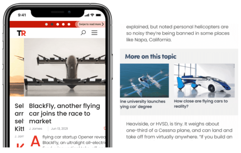
Infinite scroll – continues to load additional articles as users make their way down the screen
Instant swipe – allows readers to jump directly to the next article with a single swipe across the page, similar to many apps
Related articles – shows a carousel of other stories on similar topics within the article

Features such as these make it easier for users to navigate publisher sites and find more of the content they’re interested in. In fact, visitors spend an average of 45% longer on Prism sites compared to the standard version.
3 – Increased monetization options
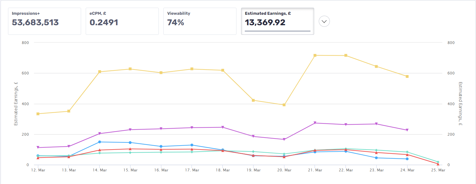
Since advertising is a core component of any publishing operation, a platform that supports a high number of demand partners is vital. AMP can be quite limited in the options available to publishers and makes it difficult to implement header bidding – perhaps not surprising given it competes with Google’s own advertising offering. Prism, on the other hand, supports both open bidding and header bidding via Prebid.js, and makes it easy to track revenue from different sources and ad units within the Clickio platform, as seen in the screenshot below.


Whereas AMP only allows specified ad formats, Prism gives publishers greater freedom to incorporate non-standard formats, such as stickies and smart banners. At the same time, Prism features a dynamic layout that can automatically adapt ad placements depending on the user’s device type and connection speed, as well as the length of particular articles. This makes a real difference when it comes to revenue, leading to an average increase of 59% in session RPM.
4 – Ease of setup
Another advantage of AMP, and a reason many publishers continue to use it, is its simplicity. While it’s possible for almost any site to set up AMP pages, without much technical expertise or costly development, Prism also retains this benefit. Simple mobile-optimized templates can be set up via a WordPress plugin or through integration with Clickio’s CDN. What’s more, while the installation process is pretty straightforward, new Prism publishers are also guided through it by a dedicated account manager who can help make sure everything is implemented correctly. After initial setup, new users are offered a free A/B test against their existing mobile site to see exactly what difference Prism will make. Here’s an example of one such test for a UK publisher, which ran for two weeks.

In this case, a faster load time and the introduction of instant swipe and related articles encouraged users to spend over 40% longer on the site, viewing 20% more pages. As a result, they also viewed more ads, which helped to increase revenue by over a third.
Moving on from AMP
AMP was a necessary stage in web development, putting user experience front and center. But, as with everything, more advanced and tailored solutions have evolved over time. By using tools, like Prism, that comply with CWVs, boost user engagement, and offer greater flexibility, publishers can ensure their mobile sites continue to promote a positive user experience, even without AMP.


